Monday, December 28, 2020

Barbara's Flowers


Here is Barbara's floral painting. I like the energy and color of her flowers.


Here is Barbara's photo. I like the way the flowers fan out from the narrow mouth and the way the dark leaves reach beyond them.


I have a few notes based on the photo.


1. The principal thing I might consider is to lighten the background and reduce the value contrast.

2. Barbara has made an interesting choice to make her vase wider and rounder than the vase in the photo. 

3. I like the spaces between the flowers. Look for the negative spaces to get the relationships right. One can of course make these relationships how you want them. I like the openness of the spaces between the flowers in the photo. I feel that it makes the flowers feel lighter.

4. Notice that with the flowers backlit, the flowers are a bit darker than represented in the painted. I suggest make them a little darker and lightening the background.

5. Even with a simplified table top, I like having the graphic of the round place mat.


I suggest that pushing the background back and darkening the flowers a little, Barbara's flowers will pop a great deal more.


I look forward to seeing the next iteration.

Friday, December 25, 2020


Here is Bev's quite accomplished and complimentary portrait of a good pup.


I don't want to make any assumptions about what Bev plans for the next steps on her painting but I'll make an assumption anyway that the legs will be finished. However, I don't know is what is intended for the background. In some ways I like the warm, simple shape here. The dog really stands out against it.


In the photo below there is a green grass background. The advantage of this in my opinion is that it allows Bev to highlight a unique feature of the dog, which is it's large, pink somewhat translucent ears. The contrast of the pink ears gets lost against a background so close to the color and value of the ears. The green color and the varied values helps set the dog apart from the environment but not removed from it. 


My suggestions are to:

1. Accentuate the pink ears by going with a simplified version of the green background of the photo. Also look to the photo for the color of the ears.

2. Consider subduing the value of the white fur in areas away from where you want to emphasize the focus which will usually be around the head. Also, the transitions between light and dark areas of fur provide an opportunity to show the texture of the fur.

3. This is a note, again about perhaps changing the color of the background.

4. I noticed in the photo that the back leg rides a bit lower on the body as indicated in this Photoshop sketch.

5. I might consider knocking down the highlight in the eyes a bit.

Bev has done a fantastic job on this portrait and these few suggested changes my be taken or not as I think that either way it will be successful when it's finished.


Lonna's Seascape

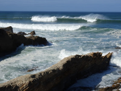
 Here is Lonna's lovely seascape featuring some dynamic waves. Lonna's pastel technique is getting really accomplished and the colors in this painting are very nice.

I like how Lonna changed the image in the photo to include some beach. It makes the painting a great deal more interesting. I see that the space has been compressed in the painting as well. The waves appear much closer in the painting due to their scale which makes them even more the stars of the show. I think that the handling of the shadows on the sand and water is very nicely done.


As you can see in Lonna's photo, she has pushed the rock formation on the right to the edge of the painting and opened the space between the rocks which I think was a good decision.

As successful as this painting is, I do have a few suggestions:

1. Be aware of the repetition of intervals.

2. I would consider taking the value of the highlights in the rock down a bit. You'll see from this suggestion and #5 that to accentuate the waves even further, taking down the contrast a little in other areas is helpful.

3. Again, be careful to not repeat size, shape and spacial relationships too much. You'll see a quick suggestion of how to vary these a little below.

4. I like the angle in the photo of this line of a breaking wave.


5. Though I think that the color of the sky on the horizon here is beautiful, I feel that the contrast in value and color pulls our eye up there and away from the waves and rocks below. Just a little less contrast helps.

Here's a quick Photoshop sketch to show a few of the ideas from above.

Remember to accentuate the curl of the wave and that you can illustrate contour of the surface of waves and other undulating shapes by showing the patterns on the surface of the shapes.

I can further explain this next time we're together live or on a zoom in the future. 

A very nice painting that can get to the next level with some relatively easy changes. Great job Lonna.


Monday, December 21, 2020

12/20/20 Marilyn's Flowers and Fruit on a Table

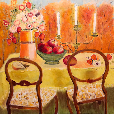
Here is Marilyn's lovely painting of Flowers and Fruit on a Table. I really like the flowers and the bowl of fruit in particular and I think that the overall yellow and orange palette overall is very nice. The white candles stand out nicely against the orange trees in the background.


 I do have a few notes for Marilyn to consider.
1. I think that the edge of the chair on the right creates tension that may be unintended by right on the edge of the picture. In the quick Photoshop example below I've moved it to the left a bit to relieve that tension.

2. These strawberries feel kind of trapped within the confines of of the chair shape. I think that the composition might benefit from the integration and overlapping of objects.

3. By moving the chair to the left, the large red fruit is less isolated by crossing behind the back of the chair.

4. Here, I think that I might open the blue up a bit and create a shape that creates a space for the top of the flowers to be showcased.

5. The pears here are beautifully painted but the scale seems a bit too large for the picture.


Here you'll notice the chair moved to the left and the fruit on the surface of the table is not confined by the shape of the back of the chair.

The pears are smaller and more in scale with the other fruit.


The slight bit of blue sky in the background gives us a shape that helps highlight the flowers.

As always, take these suggestions just my opinion. It's a very nice painting. I look forward to seeing the next iteration.