Tuesday, April 28, 2020

Susan's Brown barn

Susan has taken another pass at this brown barn. I like how she has explored several crops and approaches to painting it. I'm really taken by the color of the barn and I like how the subtly reddish brown works so well with her sophisticated greens in the trees and field.

You can see from Susan's photo the choices she's made in her painting. A really nice job.


 I have only a few comments for Susan to consider:

1. In the original there is kind of a yellow halo in the sky around the tops of the trees. If it's not intended Susan can clean that up with one more pass with the sky color.

2. There is one primary thing about this composition that that I'm a little torn about. As successful as this painting is, I kind of get pulled in two directions, to the barn, and up the road. Here, I've brought the angle of the underside of the tree down a little to keep our eye from pulling up the road so much.

3. I see in the photo that there is a sway in the ridgeline of the barn. I've tried to indicate how the general line of the roof might go downward while maintaining the sag.


And now one from the take it or leave it department.

Here I've done a quick version with the other minor suggestions from above and added a major compositional option for Susan to consider. It makes it a different painting but I feel that it might be a way to focus on the barn.

Susan has done such a great job painting the barn and trees that it might be nice to make it the undisputed star of the show.

Either way, It a beautifully painting piece Susan.

Lonna's bazaar and green roofed barn

Here are a few new paintings by Lonna. First is the fantastic final version of her Moroccan bazaar featuring the rugs she originally painted. The second is a new watercolor of a barn with a really nice, green roof.

Great job Lonna. This has such a warm animated feeling. The rugs are still the focus but I love the context you've provided.

 Here is the new watercolor. I really like the color of the barn roof. I also think that the handling of the sky and the far hills is well done. The trees have a nice consistency of style and technique and work well graphically.
 I have only two suggestions:

First, Lonna might consider cropping the bottom of the painting to shorten the foreground a bit.

Secondly, I would raise the left side of the roof to change the angle of the roof and therefore, the perspective. She wouldn't want the bottom edge of the roof to be going in the opposite direction of the ridge. The angle I've indicated may not be as sharp an angle as it could be but this feels ok.

Another nice piece Lonna.

Friday, April 24, 2020

Marilyn's table

Marilyn continues to transform her large painting of a table. Each iteration makes it more interesting.


Here is her painting a few weeks ago.


And the latest version.

I like the added value of the floor. I like the punched up color on the fruit and flowers and the table.

Unfortunately we can't yet see this in it''s true scale.


I have just a few suggestions:

1. Maybe give a the curtains a bit more curve and consider separating the one on the left from the candles and pulling the one on the right behind the flowers to to avoid tangencies with the edges of the flowers.
2. In Photoshop I added a light blue glaze to knock down the intensity of the orange tile. Though the darker value works, I think that the intensity of the orange pulls those shapes forward.
3. Maybe take the orange color off of the fruit sitting on the stool to separate it from the floor.
4. The edge of the planks on the table are out of the light and might be a little darker, though not as dark as on the right side.
5. This area on the table top may get an influence from the warm light but I would consider cooling the color back down and making it more subtle.


Or, Marilyn could be done. I think that it's looking sweet as is.


I'm looking forward to more spring paintings.

Georgia's studies

Georgia has been doing some online tutorials. She's doing some lovely work and is learning a ton. She's shared a handful. I have just a note or two of things to consider for future paintings, keeping in mind that these are quick studies following another painters lead.


We'll start with this beauty. Just fantastic.

The only thing I might consider is maybe refining  the right side of the vase as shown below.


Another nice one.

There is a classic early 19th century back to the renaissance feel to the color.

I really like the marks and the varied color of the pitcher. My favorite part of the whole painting are the brushstrokes on the inside of the pitcher.


I might consider making the shape of the gold cloth a bit more definitive. Maybe cutting it back in the upper part to allow the leaves to pop, perhaps adding a few small leaves. On the bottom part I might consider describing the planes a little more.

Maybe add a little secondary highlight on the red side.

Perhaps the red light on the pear could be knocked back a tad.


A sweet study of apples. The have nice form and color.


 If there were one change I'd consider, it would  be to consider changing the color of the table top. The broken greenish tan sets the color of the apples up nicely.
I've also indicated a subtle reflection.

 A nice academic feeling study.

The only thing I might consider is knocking the glow down a little. The contrast actually gives more weight and volume to the onion.


Keep up the good work Georgia!

Lonna's persimmons in pastels

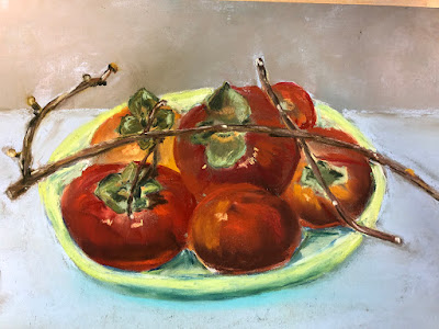
Lonna has done a few iterations of these persimmons based on a her photo of Barbara's set up.

 Here is Lonna's first pass. The drawing of the persimmons is really strong and they have a really nice, colorful presence. I like the blue of the bowl with the persimmons. However, I agree with Lonna that the shape of the bowl could use a little adjustment and the way it interacts with the bottom edge of the painting could be improved.

Here is Lonna's photo. Notice that the shallow bowl is balanced on a role of paper towels and there is no ground plane which requires her to invent one. A really nice shot of the persimmons.


Here is Lonna's second pass. Notice that she added a transition to from the table top plane to a vertical background plane. She says she's not fond of the bg color but I think it works well. As much as I like the blue bowl in the above version, I love this green color. It's so unique and I think, adds excitement to her painting.

I think that with just a few adjustments, this piece will be a knockout.

1. A quick note to make sure that the edges have integrity. The number here is small, butt he persimmon on the lower left kind of has a chunk out of it, If this were a thing, part of a style of fragmented marks it could work but if everything else is smooth than they all should.
2. I've indicated where the edges of the bowl might be with a more accurate ellipse. I like the funk of the original and it feels right. Even loosely painted however Lonna might consider lowering the back edge of the bowl. Also notice that I've indicated two possible depths for the bowl. I like the shorter, more shallow one as it fits with the interior depth she has painted.
Look for the change of planes from the rim and the front, vertical edge of the bowl. The edge out of the top light would be a bit darker as indicated.
3. At the top couple of persimmons I've noted to draw through your forms for continuity from one side of the leaf to the other.
By the way, Lonna has done a fantastic job of drawing the leaves throughout the piece.
4. I might create more of a shadow under the fruit on the bowl.
5. I've lightened up and made the three persimmons on the right more orange. I only went about halfway to where I think they could be. Refer to the photo. The darker and redder color starts to feel like a dark tomato.
6. Lonna has done a great job of painting the form shadows and the fruit has a great deal of volume. I might consider lightening the core shadow up just a little and maybe trying some violet in them to freshen them up. Notice the cast shadow from the top persimmon upon the one below it to the right.
7. Notice the cast shadows from the sticks and how they describe the form of the fruit.

I look forward to seeing this piece with just a little more work.


Leah's sunset painting

 Here is Leah's beautiful, colorful sunset painting. I really like the warm payoff at the heart of the painting.

I only have a few suggestions of how to feature this a little more.

 Here is Leah's lovely photo.


A few quick notes in Photoshop:

1. Consider trimming some of the branches on the left to allow more of the lighter sky come through to the left edge of the painting. Set up a light/dark hierarchy in which the darker land and trees are darker than even the darkest of the sky. In some cases that will mean lightening the sky and in the tree it means making those values darker.
2. I gradated the sky, making the top darker and adding a broken, light blue/purple color.
3. Though it's roughly done here, look to get the character and direction of the clouds. In the photo you can see that— 4. the clouds are lit warm from below and the tops of them have a greyish blue light influence.
5. The mountains are slightly lighter and more directly influenced by the warm colors of the sun in the center of the shape. They're a little cooler towards the edges.

A general note, We all must be aware when we change the formats of the images we're working on from the photo reference we're using. The shapes will change if we try to fit everything in. Nn this case, the photo is a more horizontal format, consequently, the shape of the warm sunset colors has gotten taller. In this case that is not a detrimental issue but be aware of this in any piece you're working on. If I'm not just winging a painting for fun and reconstructing it on the fly, I'll make sure that my reference photo and my canvas are the same ratio. It makes it easier to be efficient and allows me to put more attention on other painting issues.

Leah can enhance this painting with just a few things to bolster what she has already. Nice job.


Thursday, April 23, 2020

Susan's horses


Here is Susan's painting of wild horses. She has done a great job of placing them in the environment. I like the way that the distant mountains have character but are still second read and support the horses as the primary focus of the painting.  Susan's treatment of the grasses is excellent and much more interesting than the photo. Her painting as is, is too.


Here is the photo Susan is working from. She's done a great job of making the painting more interesting than the source. Notes are below.

1. In the painting, The area of the grasses between the horses on the left is competing because the value is quite light. By making the grasses darker, the horses pull more focus again.
2. As well as Susan has pushed the mountains back into the distance, she might consider adding a just little more broken blue back into them.
3. The forehead of this colt feels a bit wider and therefore more prominent than it could be.
4. In this one as well, the white of the forehead is larger and brighter than in the photo which makes the shape pulls forward more than it should. Also look here at how, in the photo, the back end of the horse goes towards the background and in the painting it flattens to the picture plane.
5. It feels as if the shapes above and to the side of the eyes has gotten a little large and loose. It undermines the structure of the skull. In the photo it appears as if maybe the forelocks have grown long and are the shape that is to the side of the eyes.
6. Keep an eye on the shape of the rear ends of the horses. I've cleaned them up a bit in the Photoshop notes  but the shapes aren't necessarily totally accurate to the photo.

I know that Susan is kind of over this piece but with a few quick moves with a small brush she can have another really good painting.

Heidi's accordian player

Here are two paintings Heidi has painted based on her nice photo of an accordion player on the banks of the Seine seen below.

They both have really positive aspects. I like some things about one more than the other and vice versa.

In my opinion, the ratio of the first painting feels more comfortable. I think that the space around the player lets the piece breathe.

A few lines to indicate the angles of the head and the curved vs straight lines of the shapes.

Notice that the shapes of the bellows are wider at the top of the accordion and are compressed towards the bottom.

1. I really like the hand here. The fingers are nicely engaging the keys. There is a little extra in the pinkie finger that might be cleaned up.The forearm is well drawn here but feels like the color can be finished.
2. I've indicated a lowered waterline to pop the player forward.
3. A note to pay attention to the tilt of the head. It looks pretty good here.
4. Pushing the figure to the right a bit might make the composition more comfortable as I'm feeling the figure is slightly pushed up to the left edge.
5. Look at the relationship of the shoulder to the accordion. The shoulder rises further above the accordion and has a nice curve. In this area we also see the curved shape around the tree. Heidi has done a nice job here of breaking up the horizontal lines in the background and intersecting the line with the shoulder.
6. Notice in the photo that there is a curb here and that the plane changes from horizontal to vertical and then back to horizontal. It's a nice way to add depth to the image.

1. Indicating that it would be nice to see the space widened behind the player.
2. I like the ink lines here and in several other areas on the piece.
3. Indicating again the lowering of the waterline.
4. Again, look at the shoulder to accordion relationship.
5. The intersection of the lower line of the waters edge with the arm of the player works well.
Look at completing the forearm and engaging the fingers with the keys. Make sure extra fingers aren't added. I think that the inked keys work well and the nebulous indication of the keys without the lines in the painting above isn't at successful.
I've included some images from the master illustrator/painter Gary Kelley. He's really an exceptional designer of shapes. Notice the play of straight against curved lines/edges of his dynamic shapes.

Color ain't bad either.


Tuesday, April 21, 2020

Lisa's Happy Hour Raccoon

Here is Lisa's awesome Poster Symbol for our times.

There are so many great things happening here and I think it works well as it is.

There are so many differences from one raccoon to the next that there  doesn't appear to be a set rule of how one is supposed to look exactly, like the distance between the eyes and the nose or the distance between the eyes. They seem to be as individual as people.


However, I did have a few Photoshop suggestions.


1. Though I didn't adjust them, the ears may be a little close together and a tad large.
2. Perhaps the eyes could be a little brighter and a bit larger. The skin around the eyes could be accentuated to pop the eyes. I added a bit of warm brown and pushed the blue and added a highlight.   3. The fur typically appears to widen, level with the muzzle. Kind of like raccoon muttonchops.
4. I suggested a kind of crooked smile to fun our hero up a bit.
5. I brought the height of the white up on the muzzle to bring the nose and mouth and the eyes a little more unified. It seems to make her a little happier. There is also an inward curve above the widest part of the white muzzle near the mouth.
6. Though Lisa's original raccoon nose looks great, I made it a little lighter on top and added the nostrils.
7. After looking at several raccoons I've noticed that in most of them they don't have a lot of fur on their hands. What I've indicated here isn't super accurate anatomically but shows the the shorter fur. Also having darker hands doesn't pull our eye downward away from the face.

And last, Lisa could push the warm /cool side thing a little.


At the bar.


At the end of the night.

Friday, April 17, 2020

Heidi's Red Chair

Here is is Heidi's acrylic painting inspired Paul a favorite Paul Klee. I like the warmer palette Heidi used. I think this is a beautiful pale yellow. Heidi thought I might call out the scale of various objects but I think that it's a pretty faithful rendition with a few minor exceptions in addition to the color. For instance, I like how she made the buckets cross over the line where the floor and the wall meet. I can see her giving the floor another coat to cover the grate more thoroughly. The reds could also be punched up a bit. Sometimes acrylic can take a few coats to get the intensity you want.  


I like the additional watering cans in Klee's picture. I think that Heidi made a good decision to take out the drain. I think it has too much importance in the picture as the path leading in from the left is bracketed by the cat on the table and the chair, framing the grated drain. The oddness of the composition, with the half a chair facing away from the scene, makes it intriguing.

I think that Heidi's painting is a successful interpretation of the Klee piece but to my eye, with more pleasing colors.

1. As an alternative, I thought that it might be interesting to turn the chair into the scene. It creates a different feel.

2. Notice the perspective of the legs of the table.

3. As I mentioned, I could see putting another watering can or two back in the scene but maybe staggering them slightly.

4. I might give the edge of the grass a little more rhythm.

Except for the more opaque floor and perhaps making the cat a little bigger,  I don't think that Heidi needs to change anything. It's a successful homage.


Thursday, April 16, 2020

Georgia's white roses

Here is Georgia's beautiful painting of white roses in a vase


Here is Georgia's set up. I like the contrast between the heavy earthen vase and the light, delicate flowers.
As a general note for everyone-It's helpful if the photos of both your work and of your reference is are larger. Some are coming in at higher pixel sizes, which is great. For the others please send at least the large option when emailing. In this case, because the set up is a small portion of the photo and it's not a big file, it's difficult for me to see a lot. Thanks.                                                                                        
 Above are a few notes based on the photo to consider for in the painting:

1. I like the stems and leaves above the rim of the vase. It elevates the flowers a little making them feel even lighter.

2. If I were painting this subject I'd look to keep the shapes softer and more rounded and flowing as in the photo. Especially the edges.

3. I like the larger scale of the main flower relative to the others.

4. Especially compared to this smallest flower. Notice the nice rhythm of the silhouette/contour of this flower.

5. Here I'm highlighting the shape and color of the leaves. Notice that the leaves have a nice rounded shape and they tend to be a slightly greyed, bluer, green, The place where the stem meets the flower is closer to a chrome green.

6. A few lines where I indicated the overlapping rounded shapes that form the cup of the flower. The shadows and the silhouettes tell most of the story. Of course that's a slight simplification as flowers are really complex forms.


 Below I just indicated more of the same idea based roughly on the photo. Notice that I also smoothed the contours of some of the flowers. If there is one issue with Georgia's painting that could be easily addressed to improve it, it would be to soften the slightly spikey edges of the flowers. I also moved, reduced the size and simplified the highlights on the vase.

No sooner had I indicated the shadows on the flowers when Georgia sent a quick study that shows the understanding of the stuff I mentioned above.

Another great job Georgia.