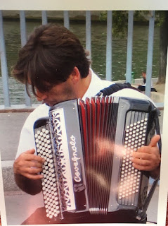
Here are two paintings Heidi has painted based on her nice photo of an accordion player on the banks of the Seine seen below.
They both have really positive aspects. I like some things about one more than the other and vice versa.
In my opinion, the ratio of the first painting feels more comfortable. I think that the space around the player lets the piece breathe.
A few lines to indicate the angles of the head and the curved vs straight lines of the shapes.
Notice that the shapes of the bellows are wider at the top of the accordion and are compressed towards the bottom.
1. I really like the hand here. The fingers are nicely engaging the keys. There is a little extra in the pinkie finger that might be cleaned up.The forearm is well drawn here but feels like the color can be finished.
2. I've indicated a lowered waterline to pop the player forward.
3. A note to pay attention to the tilt of the head. It looks pretty good here.
4. Pushing the figure to the right a bit might make the composition more comfortable as I'm feeling the figure is slightly pushed up to the left edge.
5. Look at the relationship of the shoulder to the accordion. The shoulder rises further above the accordion and has a nice curve. In this area we also see the curved shape around the tree. Heidi has done a nice job here of breaking up the horizontal lines in the background and intersecting the line with the shoulder.
6. Notice in the photo that there is a curb here and that the plane changes from horizontal to vertical and then back to horizontal. It's a nice way to add depth to the image.
1. Indicating that it would be nice to see the space widened behind the player.
2. I like the ink lines here and in several other areas on the piece.
3. Indicating again the lowering of the waterline.
4. Again, look at the shoulder to accordion relationship.
5. The intersection of the lower line of the waters edge with the arm of the player works well.
Look at completing the forearm and engaging the fingers with the keys. Make sure extra fingers aren't added. I think that the inked keys work well and the nebulous indication of the keys without the lines in the painting above isn't at successful.
I've included some images from the master illustrator/painter Gary Kelley. He's really an exceptional designer of shapes. Notice the play of straight against curved lines/edges of his dynamic shapes.
Color ain't bad either.


very helpful feedback from Michael, and I just may have to paint this again!
ReplyDelete