
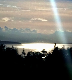
Here is Lonna's painting of a very difficult subject. I think that she's done a good job and with a few changes can get her piece to a place that can stay loose while adding depth and selling the lighting condition. She is working from a photo that is difficult to read. These kind of scenes can evoke emotional responses when viewed live but they are difficult to capture in a photograph let alone paint.
I like how Lonna has accentuated the shape of the hill seen faintly in the center of the photo. This light reflected on the water like this typically occurs with high clouds on a a bright day. This already blows things out a little and when the sun blasts through an opening in the clouds it creates an intense bright spot on the scene. I think that the edges of the transition from intense light to the surrounding areas where we can still se color and form are important to capture. In the photo we can see kind of ripple shapes. Also remember that the surface of the water is a flat plane and we can see the perspective on the surface with a vanishing point/ horizon line about halfway up the photo.
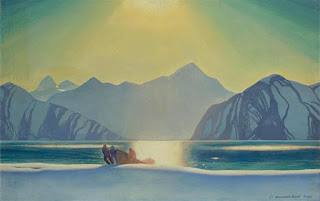
Here is a painting by Rockwell Kent who painted quite a lot in extreme northern latitudes. In this piece he captures a very similar lighting condition to Lonna's photo but gives us more information by not relying exclusively on a photo that has blown out most of the color and nuance. This is how I might approach her scene. Search for as much detail in the mountains and trees as possible and extrapolate. Notice the nice sense of depth Kent achieves by overlapping the mountains and utilizing atmospheric perspective. He has also given the water more color. Though it's not a high cloud day, that hot light would make seeing the color difficult. In plein air, in situations like that, I've found it's a good idea to look away from the lightest area and even to kind of shield your eyes to let them readjust and see color. Without the option of looking live one would have to use their memory and/or other shots of the scene. Notice in Kent's painting the very compressed transition from the colorful areas of the water to the bright light area and how there is still a little color in the bright area at the edges before the lightest bit at the center. Also to sell the effect, there are no other places in the painting where the light is that light.
1. I might overlap the mountains. Give them a rhythm and reduce the contrast as they recede. As is the shapes of the mountain and clouds both slant down to the right. I think that a few shapes countering this can help keep us in the center of the painting.
2. I like that Lonna has given the clouds a little more body. In this lighting condition with high clouds the clouds tend to be long and not puffy but for the sake of the painting it's nice to have more interesting shapes. As I've quickly drawn here the cloud shape can be used to create an arrow down to the center of the lake.
3. Even if the tree area is a nearly uniform dark color I would consider taking the time to finish the tops as in the photo which indicate that they are fir trees. This provides a sense of scale as well as completeness. As is, the foliage could be bushes which changes the feel of the scale. I like how you've created a pocket for the light area with the foliage shape.
4. Just a note to focus on the areas of transition in the water as mentioned above. Also as the water is reflecting the sky, unless its reflecting the mountains near the shore. I might consider making the sky not so pink. The color in the photo is a tough one to capture. I might just make one up that's in the ball park that I like as long as it harmonizes with the rest of the picture.
In the photo notes below, First notice that I cropped the sky which results in a changed ratio. Dont forget that we always have the power to crop our photos to make the most interesting compositions. I find that just using a couple sheets of bond paper to move the borders is helpful.
1. If you look carefully at the raw photo you can see several layers of hills. I'd play those up.
2. I like that Lonna has given the clouds more shape than seen here. I'd consider making them relatively lighter to create more depth.
3. I might add more of a transition area. Don't forget the broken up edge to show a little chop on the water.
4.I mentioned the color above.


 Lisa's super fun poster child for these stay at home times. I love how it looks like the first martini has started to take effect and how she is gripping her glass.

 Here is Georgia's beautiful still life with white flowers and a black vase. I love the barest indication of the vase. This and the leaves fading into the darkness pull us into the painting and create a sense of intimacy. The dark stage creates a dramatic setting for the white flowers. It's interesting in a piece with few very subtle colors to see how three small shapes of red can have an out-sized impact. Georgia has done a masterful job of using these red shapes to direct our eye around the picture. Notice the arc of the four flowers and the subtle counter angles the leaves take. This kind of a picture could easily be over rendered but Georgia relies more on studied indication over labored rendering to keep her painting fresh.


 Really nicely done Barbara. I think that you've made your painting stronger than the second iteration below. Notice the lighter green fabric and the more integrated shadow shape. The leaves on the left side of the arrangement are more varied and interesting. Notice also that Barbara painted the vase blue which not only is closer that the original image but separates it from the from the flowers well.

 Susan's painting captures a really nice moment. I like the loose painting and the fact that nothing is over rendered. It has the feel of a memory that we all might have. The set up of the light is really nicely done to highlight the walkers. Notice that the side light illuminates them and the shadow behind them and the very dark shape of the foliage in front of them sets the stage really, really well.
  I did a very rough bit in Photoshop to reinforce the set up that Susan has created. Explained below.
 1. I knocked the value down a little further in just a few areas, including the thin tree trunk at the bottom left edge.
 Here is Leah's abstracted landscape. I really like the direction Leah is going with her abstract pieces.
 Here is Leah's beautiful sunset photo.
 1.These shapes might be a little sharp. These are action shapes relative to the more organic shapes in the rest of the painting.
 Notice the linear quality of clouds. The warm up-lit cloud shapes are long and connected. The darker, rounder parts of the clouds, as pointed out in previous posts, are still lighter than the dark shapes of the objects on the ground plane.
 1. Indicates the gradated sky.


 Here is Heidi's original version of her outstanding still life of vegetables. I suggested adding more elements to the piece. Not necessarily all of the stuff in the photo but a bit more. I also suggested raising the bottom of the bottle a bit and maybe adding the warm orange dots.
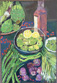 Here is Heidi's revised version. I'm sorry but I think that the dots aren't quite working either rhythmically or scale-wise without additional elements. That's my fault as I wasn't specific about how to render them or what to look for. Unfortunately I can't tell what the marks are in the photo so I can't recommend how to paint them. And in this case I'd paint them out with the interesting dark blues Heidi had in her first painting.
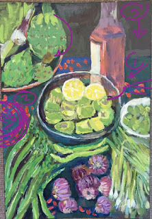 1. Though the bottom of the bottle was raised up, Heidi might also consider making the shape of the the bottom of the bottle rounder.
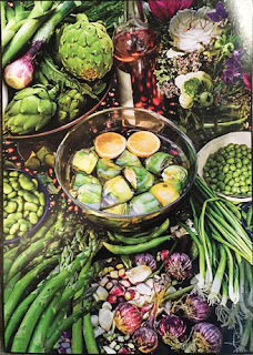

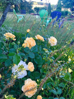
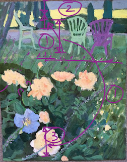 3. I might evaluate the size relationship of the chairs to the roses using the large, lowest rose as a guide for comparison.
  All of the scale and color issues are up to the artist. What was started with the painters of the last century, the loosening up and more expressive drawing and painting styles, is obviously now part of the language of all artists now. My suggestions are are intended to point out the basics of a more tradition approach to painting as I think that having an understanding of the basics and how to initially interpret the information before us gives us the tools to artfully deviate from strict representation in any way you as artists feel inspired to. That's all a long way of saying that if Heidi wants to make the chairs larger than they would appear normally or if she wants to paint the yellow area brighter and bolder than in nature, it's all good. In some cases pushing those things way more may be even better. It's all about intention.

 Here is Georgia's first pass. Well done but not quite the success of the new version.
 So here's the nitpicking part.