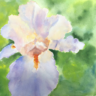
 Here is Lonna's second pass on her iris. It's beautifully done.
 If something is really complex, sometimes the best strategy is to just kind of transcribe the visual information in the most basic ways. That is, light areas and dark areas first and foremost. Within this general shape there are slight variations of value and temperature.
1. and 3. These are some of the slightly darker shapes. Notice that even the darks of most of the flower's darker shapes are not close to as dark as the dark greens of the background. This helps to pop the flower. Look for opportunities to set off both the light and dark areas of the flower with background light and darks. Everything is relative.
2. There are a lot of white or close to white areas that when painting in watercolor should be left white.
4. Notice that the bright orange shape and the space near it is larger than in the painting.
The blue-violet color in Lonna's painting is really beautiful.
So if I were to do this painting I would push the darker spaces of the flower just a bit as well as leaving the lights really light. And then I'd look to really push the darks and lights of the background to strategically push the flower foreward.

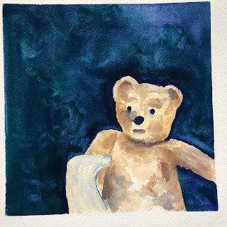 Lonna has darkened the browns of her bear to great success. A very sweet peace.
The only idea I have to take Lonna's piece a bit further is to set the context of the stay at home bear a little more by adding some panes. I also am not sure what the shape is on the arm of the bear and I might consider leaving it out of the painting. I might also add a slight smile to the bear.
Fun stuff.

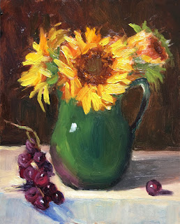 Hey All, this is how you paint grapes. Another beautiful alla prima painting by Georgia. Nice light and brushwork and I think that the colors harmonize well.
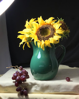 Here is Georgia's set up.
 Georgia has done another really nice piece here.
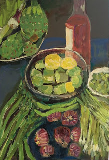 I think this new painting by Heidi is my favorite of hers so far. The rhythm and the marks and the subtle differentiation of color are all really interesting. I like the beautiful chromatic greys of the background as well. I would just like to see more.
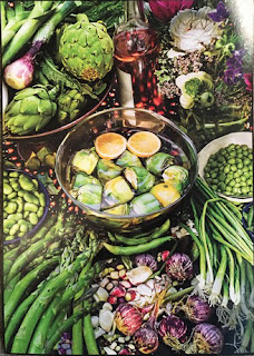 Here is Heidi's photo inspiration. As she has been so far, Heidi can select be selective when choosing a few more things to include in her picture.
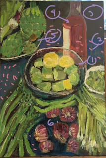
 A really sweet new one from Marilyn. It feels super fresh and feels like one of those rare ones when you just kind of nail it out of the gate. I believe that Marilyn has caught her spring groove.
 Leah has made further adjustments to her sunset painting. I think that the values are set up pretty well here. I like the silhouetted trees. The top cool cloud may be a little too uniform for this painting but it's a very nice lead into these beauties...
 Leah has a real knack for abstracting forms. I like them both but the ground plane on the left is just so beautiful so it's my favorite.
 I did just one little thing in Photoshop—extending the light across the horizon and starting the break up the shapes of the foreground trees. The purple hill color is really lovely though I might keep it on the lighter side in both the oil and watercolor versions. And as in the oil versions, lighten the darker colors in the sky and keep the tree colors dark.
 Susan has done a new version of her red barn. I like how she's punched the color up and emphasized the barn more in the composition. Really solid drawing here without feeling stiff.

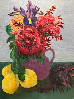 Barbara has done a great job of establishing a scale hierarchy for her flowers and lemons and also balanced her composition while retaining a nice energy and rhythm.
 Here is Lonna's photo of a teddy bear on quarantine on her block.
 And Lonna's painting. I love the background color and marks. I might not have put the object in front of the bear's arm. It makes it difficult to read what's happening. There might also be a little darker value on the bear to integrate it more with the dark background.
  I might also suggest a few variations based on Lonna's photo. I think that she should let her fertile imagination run wild.
 Here is Lonna's beautiful, delicate watercolor of an iris from her garden.
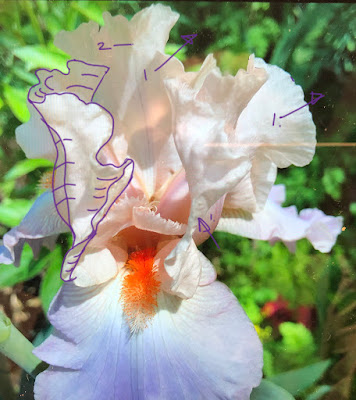 Here is Lonna's photo. I have little to add to Lonna's painting except to say to push the color and values few more passes.
 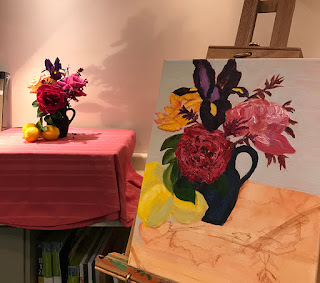 Here is Barbara's flower still life set up and here painting is progress.
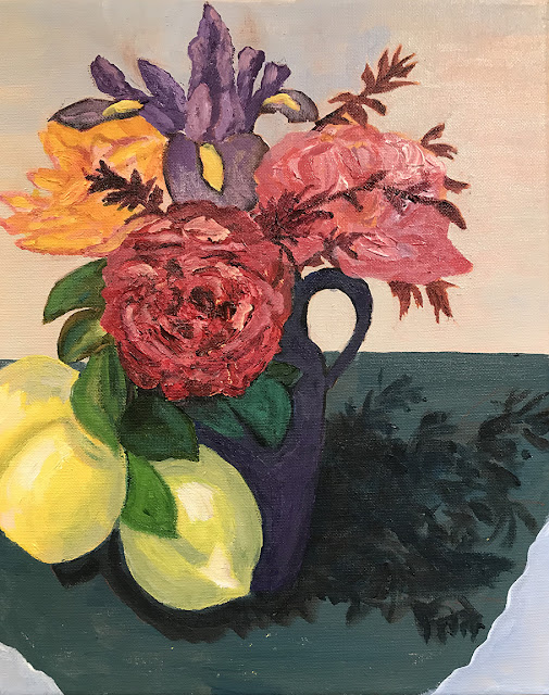 And here is Barbara's finished painting. There are so many things to like about this painting. I like the the sweeping rhythm of the leaves and lemons around the vase and the counter curve of the two red roses. The energy is great and Barbara's personal style is really developing.
 Here is Barbara's photo of her nice set up. I've noticed a few things that I might have looked for if I were to paint from this composition. Any style used or pushing or pulling of the pieces in this composition that I've broken down in this analysis to create an individual statement is fully legit. I think that looking for these kinds of relationships give us an informed basis to make decisions. This doesn't deal with color or value mostly just compositional stuff.
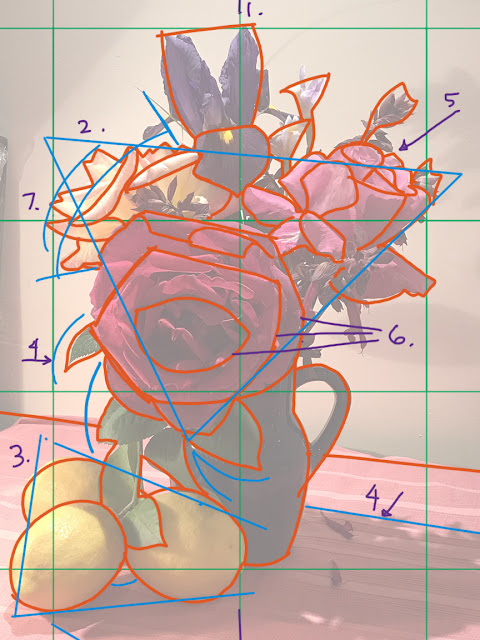 1. To get a grounding on complex subjects it's helpful to find things like the center of objects and create units of measure. Here I measured from the bottom of the vase to the main oval of the dominant flower, then to the top of the flower and then to the top of the iris. So that length was the main building block measurement. I then turned it to the horizontal axis and found that the bulk of the composition fit into two units of our basic measurement. The line labeled 1. is the center line of the composition horizontally. I find the unit of measure somewhat roughly as I would working live from a still life, a model or a landscape, by holding my arm at full length and using a pencil to measure.
 Here are a few notes on Barbara's painting directly to consider in future paintings. None of these things I'm pointing out need to be heeded. These choices are all the artist's prerogative of course.
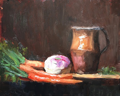 Another lovely still life piece by Georgia. My favorite parts are the painting of the turnip
 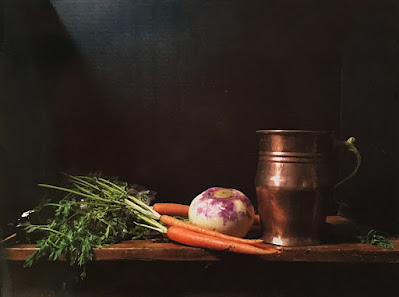 Here is Georgia's reference photo. A very classical feeling image.
 Finally an idea that I had about working from online tutorials. I'm not sure if any of you are painting with the video in real time, However, if you have a photo to work with from the session later, you all might consider just watching and absorbing the presentation and then painting your piece later rather than trying to paint with the video in real time.
  Here is Georgia's beautifully painted still life of oranges, lemons and grapes. The fruit looks better than real fruit.
 Here is Georgia's reference photo.
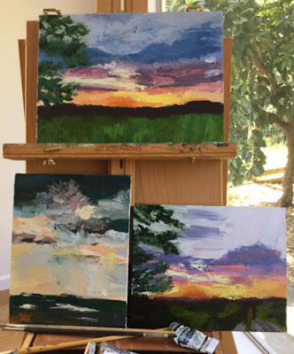 Here is a cool shot of Leah's sunset paintings in process. Bottom left is one of her paintings that she'd like to carry the style over to her sunset paintings. The bottom right is her first painting of the subject. The latest version is on top.
 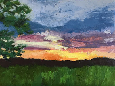 Here it is on it's own. I think that Leah has done a great job on the sky. The color feels dynamic and the colors feel cleaner. If there is one thing I might do there it would be to clean up the open sky part at the top to have a cleaner sky with just a few softer secondary clouds. Thinning a darker color and scumbling it is not an optimal substitute here for mixing the right color and making a definitive mark as she has done with the lower clouds.
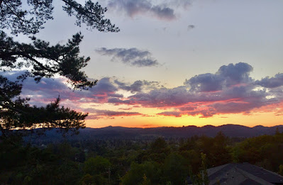 Here is Leah's original reference photo. Notice in the latest version Leah has simplified the ground plane to indicate a field instead of suburban area with trees. It can work well either way.
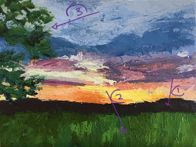 I have just a few suggestions and for reference, shot I took on a walk on my road. Yes, think of you all outside of our sessions.
 Marilyn's final painting. I feel that she has improved her painting at every step. She has kept her individual style throughout the process. The opening between the curtains creates a nice frame for her flowers. A very interesting painting. I've changed one thing in the version below. See if you can find it. It's relatively minor but it supports the downshot perspective of this piece to a degree.
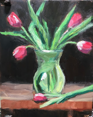 Georgia did several variations of these tulips in a glass vase. The first from an online tutorial and the others from the photo used in the tutorial. I apologize but I haven't necessarily presented these in sequence. They all work well and each have their strengths that I appreciate above the others. These paintings all have nice energy and a good combination of fidelity to the photo reference and Georgia's own interpretations.
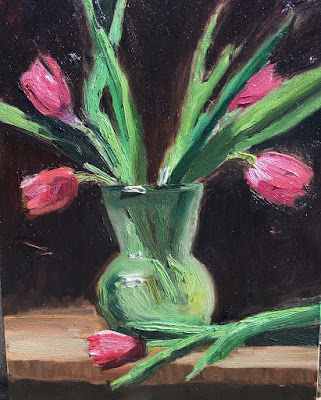 This may be my favorite because of the vigorous brush strokes and the deeper color in the dark sides of the leaves.
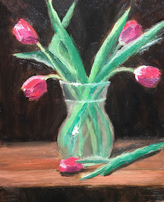 I like the warmer table top and it's relationship to the greens and reds of the tulips. This like the piece above it has a nice, rich background which sets off the tulips well.
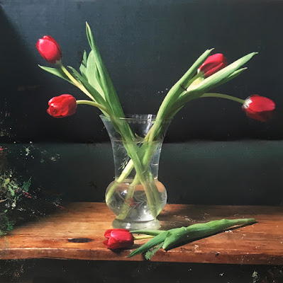 Here is the photo Georgia used as reference. I like the color and the lighting. However, I'm torn about the basic composition of the set up of the flowers with the large negative space between the two groups of flowers. Below I've added another flower to that space. More fundamentally, I've changed the orientation of canvas. One thing that I've felt about Georgia's studies is that the compositions have felt a little squeezed by the shortening of the length of the stems. I've just flipped the orientation here and opened up the composition though there may be too much negative space on the edges. The version on the bottom is for a square canvas. It allows for the extended stems but crops the excessive negative space at the edges.
 More great work Georgia.