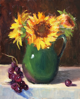
 Hey All, this is how you paint grapes. Another beautiful alla prima painting by Georgia. Nice light and brushwork and I think that the colors harmonize well.
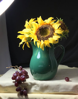
 Here is Georgia's set up.
A few notes to consider below:
1. In the photo, the petals appear longer and cooler in color. The ratio of the longer petals to the seeds in the photo is a bit more elegant. Painting the spaces between the petals to cover the orange under painting makes the cooler petals feel cooler and separate from the background,
2. The seed shape in the center of the main flower is larger than painted and shows the light side of the concave shape.
3. A cooler background also makes the yellow pop. I did a quick digital painting of the background. Notice that I left a lot of the warm under painting coming through.
4. Nice grapes!
5. I like the multiple colors of the side plane of the table. A nice subtle value change from the top plane.
6. I might consider knocking the purple reflection down a little. Look again at the photo.
7. Notice the darker and warmer seed shape here.
8. I'd consider finishing off the shapes of these nicely rendered grapes. I like think that the mass works really well.
 Georgia has done another really nice piece here.
oh geez Georgia! so beautiful!
ReplyDelete