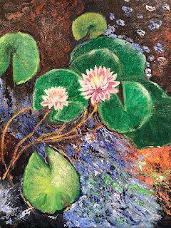
 This is such an interesting painting. I like the drawing and the grouping of the lily pads. Though I might consider cutting into the shape, I really like the painting in the large blue shape as well as several other ares of the painting. Barbara is developing a really nice style of mark making. The flowers are very well rendered in her style, integrating nicely with the whole painting.
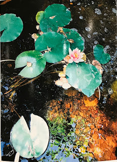
  Here is one of Barbara's photos. I prefer it to the photo below because of the nice sienna colored and green colored growth in the pond.
 1. There are areas of darker water that set off the lilies and other foliage nicely.
 3. Look to the characteristics of the shapes of one thing as it meets the the adjacent shapes. That is, the rounded sienna and green foliage as they impose on the dark and reflected blue water.
3. ( 3 number 2, oops) Notice that the color of the lilies is a bit cooler in the photo than in the painting.
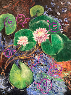
 1. I love the way Barbara has painted the stems of the lilies. The color is great and the flow in the drawing them is fantastic.
2. If Barbara were to consider adding the dark water, getting the shape of the smaller green leaves drawn accurately is important.
3.—4. A similar point made here.
5. Nicely drawn flowers and lily pads!
6. Another reminder of the cooler green color typical in lily pads.
I like this painting as it is. It has a lovely rhythm and a real stylistic integrity. Great job Barbara.
Hi, Barbara, I think the lily pads are lovely and the painting is very interesting!
ReplyDelete