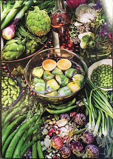
 Here is Heidi's original version of her outstanding still life of vegetables. I suggested adding more elements to the piece. Not necessarily all of the stuff in the photo but a bit more. I also suggested raising the bottom of the bottle a bit and maybe adding the warm orange dots.
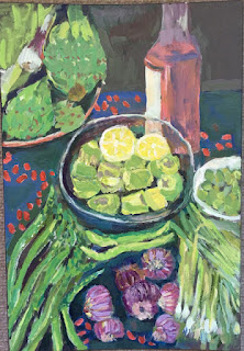 Here is Heidi's revised version. I'm sorry but I think that the dots aren't quite working either rhythmically or scale-wise without additional elements. That's my fault as I wasn't specific about how to render them or what to look for. Unfortunately I can't tell what the marks are in the photo so I can't recommend how to paint them. And in this case I'd paint them out with the interesting dark blues Heidi had in her first painting.
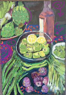 1. Though the bottom of the bottle was raised up, Heidi might also consider making the shape of the the bottom of the bottle rounder.
2. and 3. Are suggestions to add just a few more elements if Heidi isn't too burned out on it.
I know how tedious painting all of these elements can be, especially when painted with the intense attention Heidi has painted them. I still think that Heidi's painting is beautifully done and very interesting as it was and I might only take out the red spots to get back to closer to the original if she doesn't want to continue working on it.
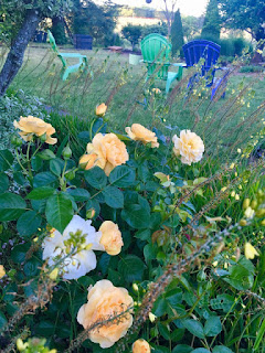
Heidi's new painting of of backyard chairs. It's very charming and it's the second painting submitted this week that reminds me of the post-impressionist, Nabis painters from the late 1800's and early 1900's'
I like the rhythm of the flowers and leaves in the rose bush and the colors overall are really nice.
I have just a few suggestions below.
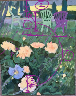 3. I might evaluate the size relationship of the chairs to the roses using the large, lowest rose as a guide for comparison.
 1. Also note the size of the lower part of the painting compared to the top part. The bottom part is closer to us and therefore larger in the picture plane.
2. Though the light yellow color in the top of the painting is beautiful. I feel it's pulling our attention more than any other shape in the painting. This is primarily due to the contrast to the dark trees up there. As we look at the photo we see that none of the trees in the background are as dark as the darkest areas of the leaves in the foreground. Also, the yellow shape is smaller and the intensity of the color is reduced.
In the photo below we notice,
1. that Ive trued up the horizon by rotating the photo. Heidi has done a nice job of this in her painting. This is just a reminder to everyone to do that before you start painting to make it easier on yourselves.
2. Heidi's flowers are nicely done. This is just a reminder for us all to think about the axis and direction of things like these flowers.
3. The grasses here tend to be bending in the same direction. I understand that's how they are. I might consider varying the spacing and bunching of them and maybe countering the angle of some of them to make them more interesting in the painting.
 All of the scale and color issues are up to the artist. What was started with the painters of the last century, the loosening up and more expressive drawing and painting styles, is obviously now part of the language of all artists now. My suggestions are are intended to point out the basics of a more tradition approach to painting as I think that having an understanding of the basics and how to initially interpret the information before us gives us the tools to artfully deviate from strict representation in any way you as artists feel inspired to. That's all a long way of saying that if Heidi wants to make the chairs larger than they would appear normally or if she wants to paint the yellow area brighter and bolder than in nature, it's all good. In some cases pushing those things way more may be even better. It's all about intention.
I think that Heidi has a really good start on this painting and it won't take much to finish nicely.

No comments:
Post a Comment