
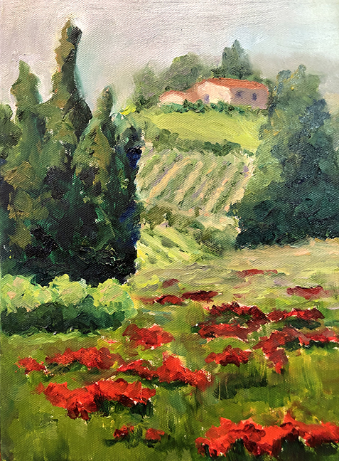
And here is her second go at the subject. Here there is a better sense of space and the scale relationships. Notice the adjusted scale and diminishing size of the poppies in the foreground plane as they recede. The color is cleaner here. I do like the varied color in the dirt between the rows in the painting above a bit more. I like the energy and color of the main grouping of trees in this version.

1. the hill to the left of the house kind of disappears. It might be better to continue through on the hill with just a small drop off as it goes to the left.
2. even though this is a loose painting, getting the silhouette shape right is important. Here it's a tad fuzzy. I really like the color of the trees on the left but once again, just a little more attention to the actual shape of the tree's silhouette would help.
3. the red color of the poppies is gorgeous. The flowers may be a little smaller still though.

I have a few more suggestions.
I might open up and unclutter the space for the vineyards. Notice the counter rhythms indicated by the purple lines. The kind of zig zag. Also notice the curvature of the rows of vines to indicate the volume of the curved hills.
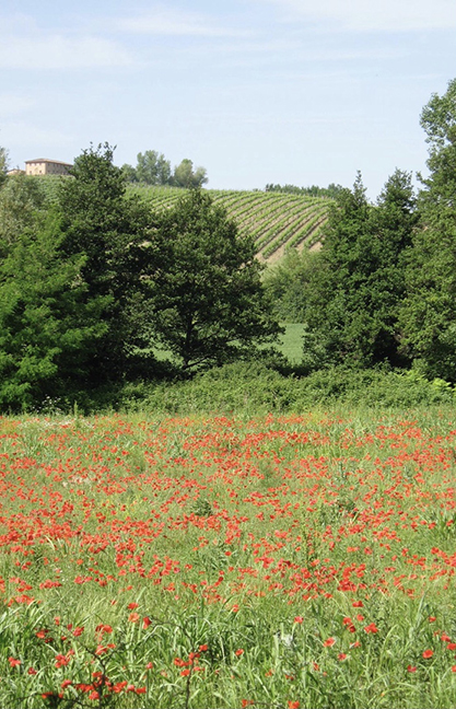
I added a few trees in the distance in a relative scale like in the photo but put them behind the house. Look for the curved shapes of the trees and bushes in the photo. Having a tighter scale and a different rhythm of the curved shapes in the trees to contrast the longer curving shapes of the vineyards adds interest.
Make sure your house doesn't get to large. When objects in the background get too big it flattens the space dramatically. Lonna has improved the relationships in the second painting but might consider pushing the scale of the house and far hill back a little more. The size of the vineyard rows will diminish as the rows recede. These suggestions are to deepen the space of the landscape.
Here I've also simplified the large middle ground trees and created another staggered relationship for interest. I really like the dynamic foreground flowers in Lonna's painting but I've made them smaller here to indicate a little bit of a truer scale relationship to the trees. Maybe somewhere in between would work to retain the dynamic.
I really like Lonna's painting, especially the color and loose painting. I know exactly what I'm looking at here and her painting allows us to put ourselves into the landscape.
Here's a painting to illustrate scale (even though the foreground flowers are a little big) by some old french guy.

No comments:
Post a Comment