
Here is Barbara's floral painting. I like the energy and color of her flowers.

Here is Barbara's photo. I like the way the flowers fan out from the narrow mouth and the way the dark leaves reach beyond them.
I have a few notes based on the photo.
1. The principal thing I might consider is to lighten the background and reduce the value contrast.
2. Barbara has made an interesting choice to make her vase wider and rounder than the vase in the photo.
3. I like the spaces between the flowers. Look for the negative spaces to get the relationships right. One can of course make these relationships how you want them. I like the openness of the spaces between the flowers in the photo. I feel that it makes the flowers feel lighter.
4. Notice that with the flowers backlit, the flowers are a bit darker than represented in the painted. I suggest make them a little darker and lightening the background.
5. Even with a simplified table top, I like having the graphic of the round place mat.


I suggest that pushing the background back and darkening the flowers a little, Barbara's flowers will pop a great deal more.
I look forward to seeing the next iteration.


 Lisa's super fun poster child for these stay at home times. I love how it looks like the first martini has started to take effect and how she is gripping her glass.

 Here is Georgia's beautiful still life with white flowers and a black vase. I love the barest indication of the vase. This and the leaves fading into the darkness pull us into the painting and create a sense of intimacy. The dark stage creates a dramatic setting for the white flowers. It's interesting in a piece with few very subtle colors to see how three small shapes of red can have an out-sized impact. Georgia has done a masterful job of using these red shapes to direct our eye around the picture. Notice the arc of the four flowers and the subtle counter angles the leaves take. This kind of a picture could easily be over rendered but Georgia relies more on studied indication over labored rendering to keep her painting fresh.

 Here is Lonna's painting of a very difficult subject. I think that she's done a good job and with a few changes can get her piece to a place that can stay loose while adding depth and selling the lighting condition. She is working from a photo that is difficult to read. These kind of scenes can evoke emotional responses when viewed live but they are difficult to capture in a photograph let alone paint.
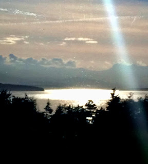


 Really nicely done Barbara. I think that you've made your painting stronger than the second iteration below. Notice the lighter green fabric and the more integrated shadow shape. The leaves on the left side of the arrangement are more varied and interesting. Notice also that Barbara painted the vase blue which not only is closer that the original image but separates it from the from the flowers well.

 Susan's painting captures a really nice moment. I like the loose painting and the fact that nothing is over rendered. It has the feel of a memory that we all might have. The set up of the light is really nicely done to highlight the walkers. Notice that the side light illuminates them and the shadow behind them and the very dark shape of the foliage in front of them sets the stage really, really well.
  I did a very rough bit in Photoshop to reinforce the set up that Susan has created. Explained below.
 1. I knocked the value down a little further in just a few areas, including the thin tree trunk at the bottom left edge.
 Here is Leah's abstracted landscape. I really like the direction Leah is going with her abstract pieces.
 Here is Leah's beautiful sunset photo.
 1.These shapes might be a little sharp. These are action shapes relative to the more organic shapes in the rest of the painting.
 Notice the linear quality of clouds. The warm up-lit cloud shapes are long and connected. The darker, rounder parts of the clouds, as pointed out in previous posts, are still lighter than the dark shapes of the objects on the ground plane.
 1. Indicates the gradated sky.


