
I'll wait to critique it until Marilyn comes down from cloud nine and gets another session on the piece.
Congratulations Marilyn.
I'll wait to critique it until Marilyn comes down from cloud nine and gets another session on the piece.
Congratulations Marilyn.

Here is Susan's beautiful portrait of a white house and yard.
first of all, I think that the color is really beautiful. I especially like the color and paint handling of the house and the hedge and grass area.
I only have a few suggestions but they apply to a few areas. The first version below is unmarked up and the one below shows the areas.


2. The same idea applies to the dark areas around the lower trees. In the orange and yellow ones on the left, I think separating them with dark areas makes each more interesting.
One other thing I'd be conscious of is how the top parts of the trees are finished and to mix up the heights and widths a little. Paint through the edges of the painting as opposed to painting right up to them.
This is a study and I think that the final is going to be fantastic and I can't wait to see it.


Here are the first of Barbara's four flower paintings.
first I'd like to say that I'm really impressed with the bold strokes, color and experimentation with the composition. I can't help but think that Barbara learned a ton in this process and that it will be a good thing to do going forward. I'm not sure which is my favorite but I'll start with this one.
I just really like this one. I think that the color and scale of the flowers work so well. The flower shapes relative to the edges is just about perfect. The ratio of the ground plane to background feels just right.
A few notes:
1. I like all this.
2. Here Barbara might firm up some of the edges of the flowers in this area to delineate them.


This is the worked version of the painting Barbara submitted a few weeks ago. I think that she's succeeded in pushing the background back by lightening and softening it.
3. To further separate the foreground and background, sharpening the edges of the flowers and leaves in the arrangement will help as indicated in the marked up version above.
1. and 2. This is just a note to point out that in my opinion, the colors of both the curtains and the table top could use some work. The work Barbara has done on the background and the color in the flowers, which look really good, make it worth playing with color in these other areas to have a nice piece.
(I'm sorry for the order of these paintings relative to the copy. Google has succeed in making this program, which used to work really well, about as stubborn and stupid as possible.)
I like the dynamic color and interesting array of flowers in the painting below. My only suggestions are
1. Watch out for the tangencies with the edges of the painting-that is, try not to end shapes close or right at the edge.
2. My eye is pullingto this are more than even the flowers. I think that it's primarily due to the hard edges and relatively high contrast of the largish geometric shapes. The perspective of the table top is nicely done but also leads us to this area. Maybe consider softening the edges and making the background color (as nice as it is) lighter, graduating the value from the top to this area.
It would be nice to get feedback from the other Silala painters on this to see if they agree with me or if they don't think this is an issue.
Overall, I think this piece is very nice. As I said, I really like the flower arrangement and I especially like the painting of the vase.


I think that this painting works great. The bottom half is really interesting. The flattened circular shape and the color and pattern of the tablecloth work super well. The painting of the vase is nicely done as well.
I think that the flowers are nicely composed and the shape and size relationships a very good.
My only notes are that
2. I might make the color on some of the flowers cleaner and also the edges of the flowers could be more defined.
1. Here, like in the previous painting, the geometric shapes may be undermining the impact of the flowers a little. I feel that the isolated light shape along the left edge may be pulling too much attention. I've taken ithe edge out for Barbara to compare. It could be just be a personal preference and the edge of the window is nicely painted so it could be left in if preferred.
3. Here I would soften the edges of the table top, wall and window. I might also give just a little more subtle color to bottom of the window as well as the wall.
There are so many things to like about this series of paintings. This feels like a big step for Barbara and I'm looking forward to seeing what she paints next.

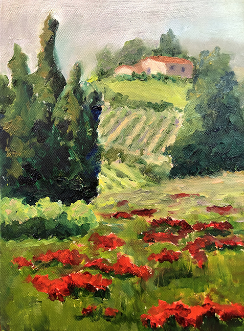
And here is her second go at the subject. Here there is a better sense of space and the scale relationships. Notice the adjusted scale and diminishing size of the poppies in the foreground plane as they recede. The color is cleaner here. I do like the varied color in the dirt between the rows in the painting above a bit more. I like the energy and color of the main grouping of trees in this version.

1. the hill to the left of the house kind of disappears. It might be better to continue through on the hill with just a small drop off as it goes to the left.
2. even though this is a loose painting, getting the silhouette shape right is important. Here it's a tad fuzzy. I really like the color of the trees on the left but once again, just a little more attention to the actual shape of the tree's silhouette would help.
3. the red color of the poppies is gorgeous. The flowers may be a little smaller still though.

I have a few more suggestions.
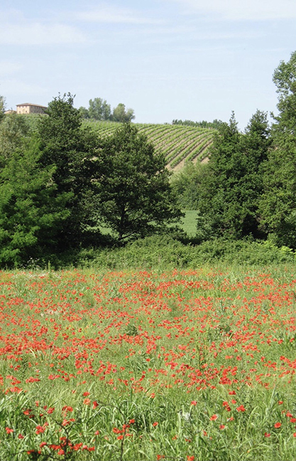
I might open up and unclutter the space for the vineyards. Notice the counter rhythms indicated by the purple lines. The kind of zig zag. Also notice the curvature of the rows of vines to indicate the volume of the curved hills.
I added a few trees in the distance in a relative scale like in the photo but put them behind the house. Look for the curved shapes of the trees and bushes in the photo. Having a tighter scale and a different rhythm of the curved shapes in the trees to contrast the longer curving shapes of the vineyards adds interest.
Make sure your house doesn't get to large. When objects in the background get too big it flattens the space dramatically. Lonna has improved the relationships in the second painting but might consider pushing the scale of the house and far hill back a little more. The size of the vineyard rows will diminish as the rows recede. These suggestions are to deepen the space of the landscape.
Here I've also simplified the large middle ground trees and created another staggered relationship for interest. I really like the dynamic foreground flowers in Lonna's painting but I've made them smaller here to indicate a little bit of a truer scale relationship to the trees. Maybe somewhere in between would work to retain the dynamic.
I really like Lonna's painting, especially the color and loose painting. I know exactly what I'm looking at here and her painting allows us to put ourselves into the landscape.
Here's a painting to illustrate scale (even though the foreground flowers are a little big) by some old french guy.


Here is Barbara's photo. I like the way the flowers fan out from the narrow mouth and the way the dark leaves reach beyond them.
I have a few notes based on the photo.
1. The principal thing I might consider is to lighten the background and reduce the value contrast.
2. Barbara has made an interesting choice to make her vase wider and rounder than the vase in the photo.
3. I like the spaces between the flowers. Look for the negative spaces to get the relationships right. One can of course make these relationships how you want them. I like the openness of the spaces between the flowers in the photo. I feel that it makes the flowers feel lighter.
4. Notice that with the flowers backlit, the flowers are a bit darker than represented in the painted. I suggest make them a little darker and lightening the background.
5. Even with a simplified table top, I like having the graphic of the round place mat.


I suggest that pushing the background back and darkening the flowers a little, Barbara's flowers will pop a great deal more.
I look forward to seeing the next iteration.

Here is Bev's quite accomplished and complimentary portrait of a good pup.
I don't want to make any assumptions about what Bev plans for the next steps on her painting but I'll make an assumption anyway that the legs will be finished. However, I don't know is what is intended for the background. In some ways I like the warm, simple shape here. The dog really stands out against it.
In the photo below there is a green grass background. The advantage of this in my opinion is that it allows Bev to highlight a unique feature of the dog, which is it's large, pink somewhat translucent ears. The contrast of the pink ears gets lost against a background so close to the color and value of the ears. The green color and the varied values helps set the dog apart from the environment but not removed from it.


My suggestions are to:
1. Accentuate the pink ears by going with a simplified version of the green background of the photo. Also look to the photo for the color of the ears.
2. Consider subduing the value of the white fur in areas away from where you want to emphasize the focus which will usually be around the head. Also, the transitions between light and dark areas of fur provide an opportunity to show the texture of the fur.
3. This is a note, again about perhaps changing the color of the background.
4. I noticed in the photo that the back leg rides a bit lower on the body as indicated in this Photoshop sketch.
5. I might consider knocking down the highlight in the eyes a bit.
Bev has done a fantastic job on this portrait and these few suggested changes my be taken or not as I think that either way it will be successful when it's finished.
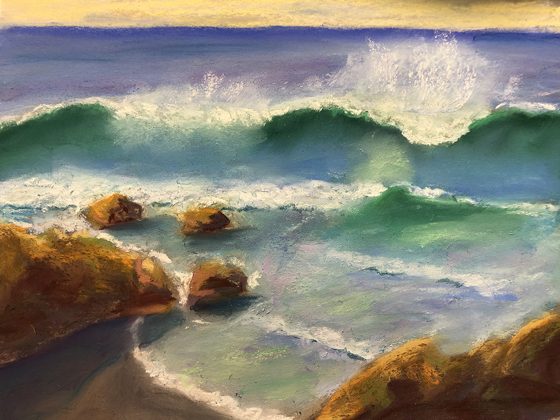
I like how Lonna changed the image in the photo to include some beach. It makes the painting a great deal more interesting. I see that the space has been compressed in the painting as well. The waves appear much closer in the painting due to their scale which makes them even more the stars of the show. I think that the handling of the shadows on the sand and water is very nicely done.


1. Be aware of the repetition of intervals.
2. I would consider taking the value of the highlights in the rock down a bit. You'll see from this suggestion and #5 that to accentuate the waves even further, taking down the contrast a little in other areas is helpful.
3. Again, be careful to not repeat size, shape and spacial relationships too much. You'll see a quick suggestion of how to vary these a little below.
4. I like the angle in the photo of this line of a breaking wave.
 5. Though I think that the color of the sky on the horizon here is beautiful, I feel that the contrast in value and color pulls our eye up there and away from the waves and rocks below. Just a little less contrast helps.
Here's a quick Photoshop sketch to show a few of the ideas from above.
Remember to accentuate the curl of the wave and that you can illustrate contour of the surface of waves and other undulating shapes by showing the patterns on the surface of the shapes.
I can further explain this next time we're together live or on a zoom in the future.
A very nice painting that can get to the next level with some relatively easy changes. Great job Lonna.
Here is Marilyn's lovely painting of Flowers and Fruit on a Table. I really like the flowers and the bowl of fruit in particular and I think that the overall yellow and orange palette overall is very nice. The white candles stand out nicely against the orange trees in the background.


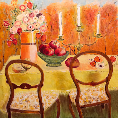
Here you'll notice the chair moved to the left and the fruit on the surface of the table is not confined by the shape of the back of the chair.
The pears are smaller and more in scale with the other fruit.
The slight bit of blue sky in the background gives us a shape that helps highlight the flowers.
As always, take these suggestions just my opinion. It's a very nice painting. I look forward to seeing the next iteration.


 Lisa's super fun poster child for these stay at home times. I love how it looks like the first martini has started to take effect and how she is gripping her glass.
