Lonna has captured the energy of the ocean at this familiar spot in Pacific Grove. I like the painting of the trees as it reminds me of the post impressionist era painter of the Nabis like Vullard and the painter Maurice de Vlaminck. She has simplified the of the houses and stuff to essential shapes that fit really well stylistically with the painting of the trees. I think that this could be done as is.
Just for teaching purposes I have a few points below.
This is Lonna's beautiful photo.
1. Notice the relative values of the trees on the spit and the darkest areas of the clouds. The trees are significantly darker.
2. I've indicated several areas where to observe the change of planes.
3. look for the big shapes of objects and as indicated here, ares of of foamy water that help describe the contours of the undulating water. The large spaces between these whiter shapes are light blue, reflecting the blue sky.
4. Another example describing the undulating water.
5. Notice that the areas of vertical spray are small relative to the overall scene.
Given that, Lonna's painting is more vigorous and exciting, the scene in the photo is a bit more tranquil.
1. This area of clouds could be a little lighter.
2. This area of ocean might be lighter.
3. I could see this area be a little beefier and more connected to the dark side shape. The color in this area and some of the other light stone areas might be cooler.
4. Maybe a little more refinement of the supporting horizontal plane and the transition to the spray.
5. Again, I really like this area.
This is nicely done Lonna.

 Susan's first pass.


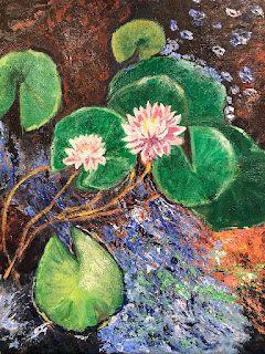 This is such an interesting painting. I like the drawing and the grouping of the lily pads. Though I might consider cutting into the shape, I really like the painting in the large blue shape as well as several other ares of the painting. Barbara is developing a really nice style of mark making. The flowers are very well rendered in her style, integrating nicely with the whole painting.
 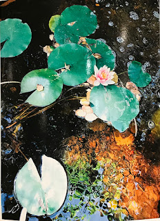 Here is one of Barbara's photos. I prefer it to the photo below because of the nice sienna colored and green colored growth in the pond.
 1. There are areas of darker water that set off the lilies and other foliage nicely.
 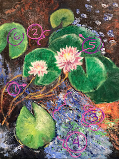 1. I love the way Barbara has painted the stems of the lilies. The color is great and the flow in the drawing them is fantastic.
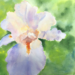 Here is Lonna's second pass on her iris. It's beautifully done.
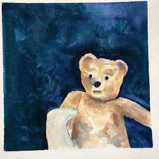 Lonna has darkened the browns of her bear to great success. A very sweet peace.
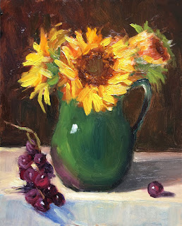 Hey All, this is how you paint grapes. Another beautiful alla prima painting by Georgia. Nice light and brushwork and I think that the colors harmonize well.
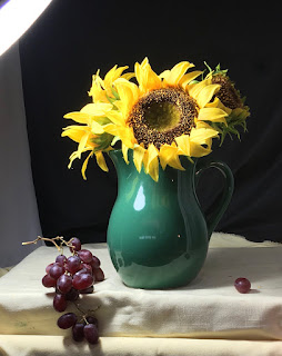 Here is Georgia's set up.
 Georgia has done another really nice piece here.
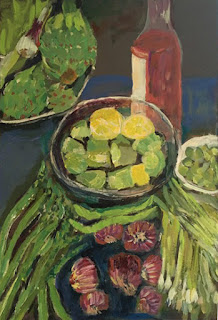 I think this new painting by Heidi is my favorite of hers so far. The rhythm and the marks and the subtle differentiation of color are all really interesting. I like the beautiful chromatic greys of the background as well. I would just like to see more.
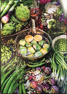 Here is Heidi's photo inspiration. As she has been so far, Heidi can select be selective when choosing a few more things to include in her picture.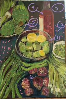
 A really sweet new one from Marilyn. It feels super fresh and feels like one of those rare ones when you just kind of nail it out of the gate. I believe that Marilyn has caught her spring groove.
 Leah has made further adjustments to her sunset painting. I think that the values are set up pretty well here. I like the silhouetted trees. The top cool cloud may be a little too uniform for this painting but it's a very nice lead into these beauties...
 Leah has a real knack for abstracting forms. I like them both but the ground plane on the left is just so beautiful so it's my favorite.
 I did just one little thing in Photoshop—extending the light across the horizon and starting the break up the shapes of the foreground trees. The purple hill color is really lovely though I might keep it on the lighter side in both the oil and watercolor versions. And as in the oil versions, lighten the darker colors in the sky and keep the tree colors dark.
 Susan has done a new version of her red barn. I like how she's punched the color up and emphasized the barn more in the composition. Really solid drawing here without feeling stiff.

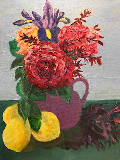 Barbara has done a great job of establishing a scale hierarchy for her flowers and lemons and also balanced her composition while retaining a nice energy and rhythm.